Due to the fast-paced expansion of Western businesses to Asian markets, there is an urgent need to reach farther audiences in promoting and selling goods and services. In today’s digital world, the web has a crucial role in determining a business’s success. However, being able to win the hearts and minds of consumers that belong to such different cultures may pose a challenge for any marketer.
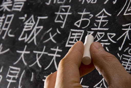
In the West, there is a prevailing impression that Japan’s notion of beauty lies in minimalism: tranquil Zen gardens and serene temples.
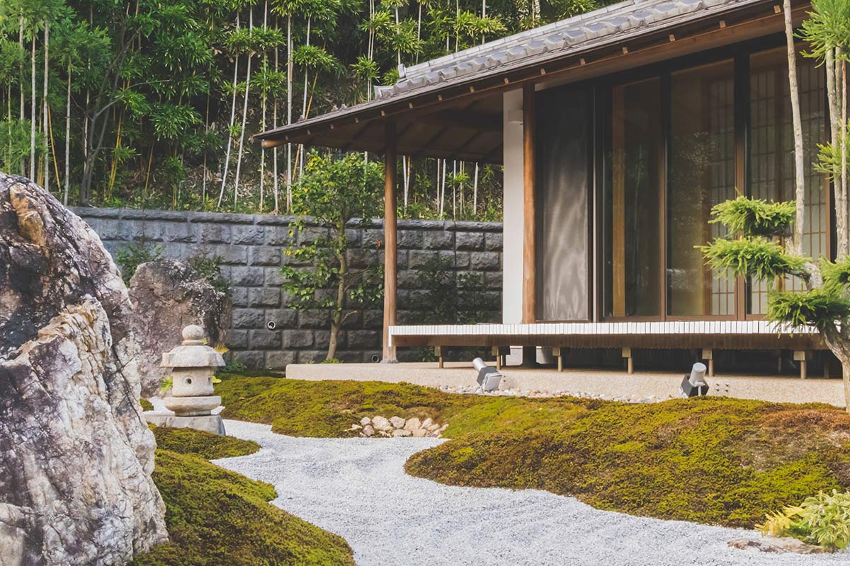
Photo by pepe nero on Unsplash
However, this is only one side of the coin. The other shows cityscapes that bombard the viewer with brightly lit neon advertisements. This duality in the Japanese aesthetic has also translated to the online world.
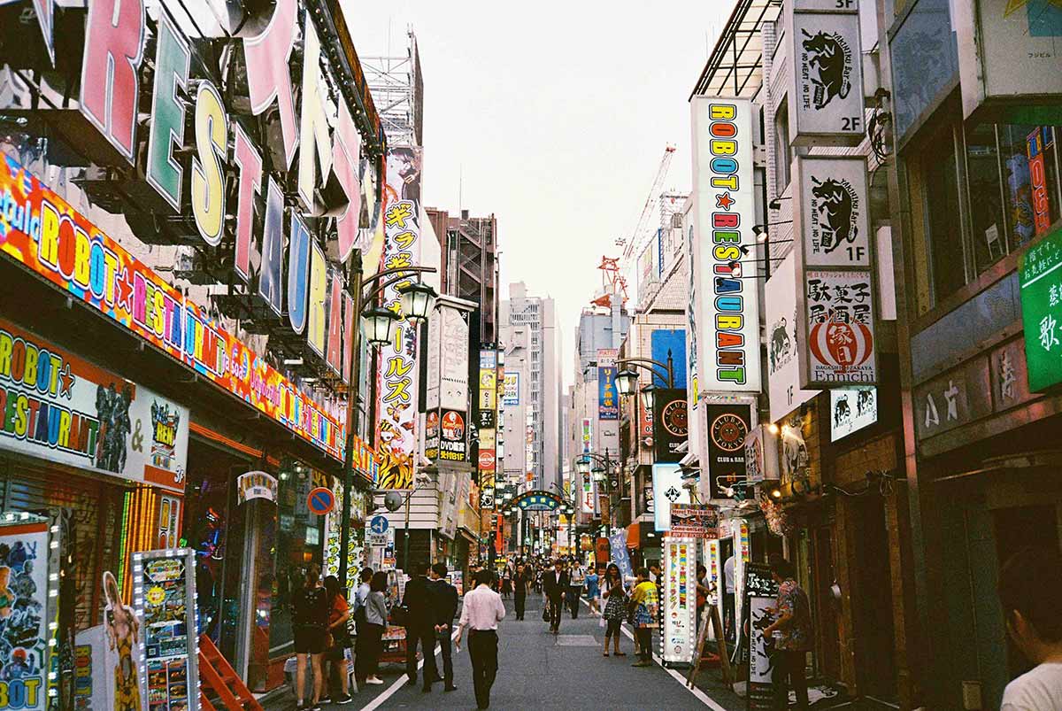
Photo by Albert Dera on Unsplash
This article will discuss the characteristics of Japanese websites, investigate the things that make them different as well as the reasons behind the differences.
Characteristics of a Japanese Website
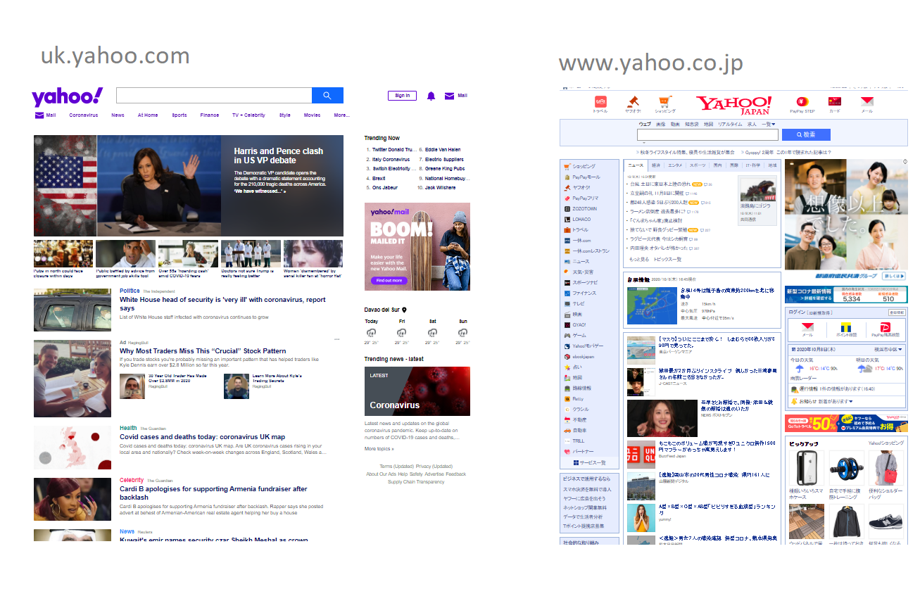
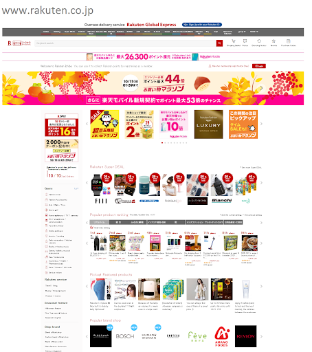
There are many unique and particular features that make Japanese websites starkly different from others. These characteristics include using a lot of text, having a busy layout, displaying smaller graphics, featuring cute characters, contrasting and clashing colors, as well as using flash animation.
A lot of text
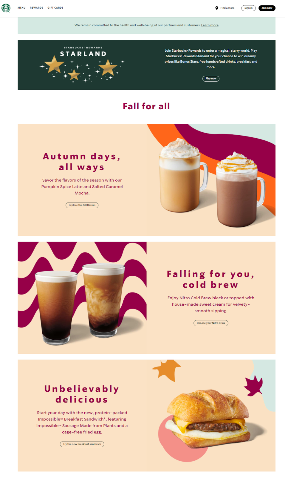
Several websites from the West prefer fewer texts. Big font sizes and images are used to emphasize the company’s featured products, and the descriptions are explained briefly. CTA buttons are often utilized to direct the user to more information about these products. Moreover, websites usually apply a few colors representing their company, similar to the Starbucks’ website below, which employs a simple color scheme.
The expansive use of text is due to the nature of the language itself. In contrast to the English alphabet, Japanese characters are logo graphic in nature. Thus, when they are combined, they create words that consume less space and give more meaning. Because of this, what may seem like a few sentences may actually be an entire paragraph.
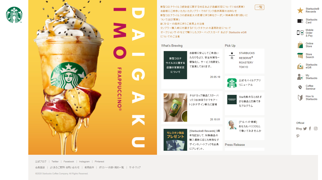
Another main reason for such heavy use of text is the need to convince buyers. As shown on Starbucks Japan’s website, the featured product covers almost half of the website’s space. Smaller images are used to make way for the announcements, news, and menu items. Aside from the featured product’s name in a bigger font, other information on the website has smaller font sizes.
As opposed to many Western buyers, Japanese consumers require a substantial amount of detail and convincing before they buy an item. Thus, the information should be accessible to visitors without scrolling or going through a series of steps and buttons. This, in turn, led to Japanese websites’ utilization of larger amounts of text to give more room to the details of the product they’re promoting.
Crowded and busy
In addition, another reason why Japanese web designs are so different is due to the placement of elements. To the casual eye, it can be easily seen that Japanese web designs lack negative space. This results in the perception that various web elements, which include text and pictures, have been squeezed into a tiny space.
This can be explained by the culture of the Japanese. May it be the space their homes take or the food on their plate, the Japanese discourage wastage. As a result, this culture for resource utilization has seeped into their digital world and has made it certain that digital space is utilized.
Smaller Graphics
The size of the images used on Japanese websites also makes them stand out from their western counterparts. Western websites use large and high-resolution images which increase the website’s aesthetics and improve its impact. This is in contrast to Japanese websites which are the opposite.
Japanese websites make use of small and low-resolution pictures at various locations. These pictures are not many and they are placed mainly for performance purposes. According to a study, it was found that online users were likely to leave a website if it did not open within 3 seconds. This is taken even more seriously by the Japanese. Thus, maintaining a smooth experience is very crucial. This can be achieved by ensuring that web pages load as quickly as possible by optimizing the use of text as well as images.
It’s so “Kawaii”
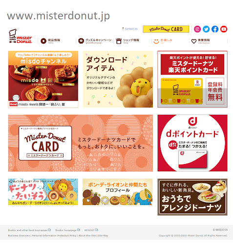
There are numerous Japanese websites that seem to use style elements borrowed from the anime character world. Chibi style characters and cute fonts are usually found on website home pages or as part of advertisements. “Kawaii”, often translated as cuteness, is a prevailing cultural theme in Japan, even though it can sometimes be interpreted as childish or inappropriate by the non-Japanese.
Just a Clash of Color
One other reason which makes Japanese web design different from the rest is its use of various colors. Color is an essential part of the country’s culture, take Kimonos as an example. Japanese websites often display a range of varying colors which include blue, red, pink, orange, and even yellow.
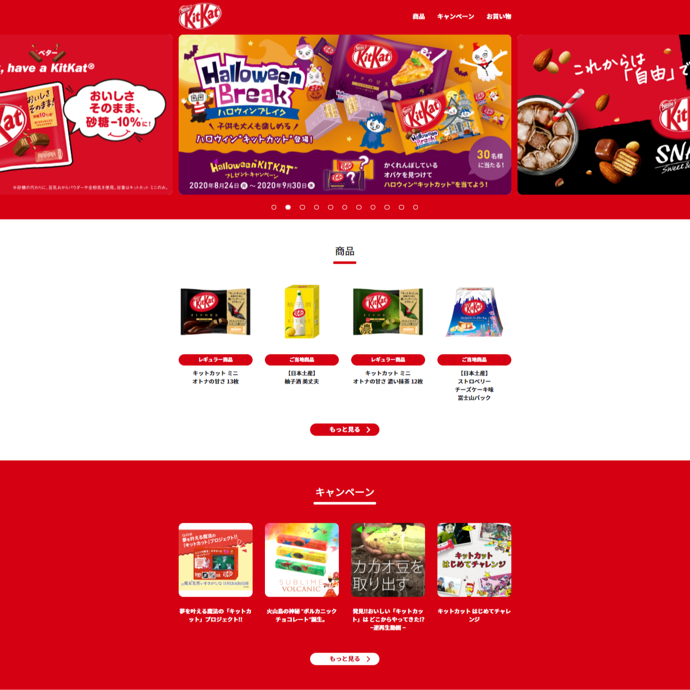
The purpose of this extensive use of bold and striking colors is to attract the attention of viewers. The contrasting and often clashing colors help draw attention to different areas on a web page, with bold colors often attracting the largest number of users.
Flash Fever
Most of the aesthetically attractive websites in Japan are observed to be created using Adobe Flash, which is considered outdated technology. One possible reason behind this is that because of the popularity of Flash-based gaming in Japan, there is a vast pool of skilled Flash designers that can be locally drawn upon.
Why is it different?
The differences between Japanese web design from western ones are due to three factors: linguistic, cultural, and technical.
Linguistic differences
As mentioned earlier, Japanese has a logographic-based writing system. Thus, a few characters could already contain a lot of meaning compared to the western alphabet. For western viewers, these Japanese characters may seem cluttered and confusing. However, they actually enable Japanese users to become comfortable with processing a lot of information in a short amount of time.
Moreover, the Japanese writing system also doesn’t have italics or capital letters which limits the opportunities for adding emphasis unlike that with Latin alphabets. This, in turn, makes it more difficult to use merely type in creating the hierarchical contrasts required to organize information. Therefore, Japanese designers overcome this by using graphic text.
The fact that most web and programming languages were designed by English or western corporations means that the majority of documentation and educational resources are in English. Thus, although most of these resources are translated into Japanese, there is still a delay in technologies being up-to-date.
Cultural differences
One of the specificities of Japanese culture that has influenced their web design is Japanese consumer behavior. Japanese consumers require a high level of assurance prior to making a purchase decision. This means products must come with lengthy descriptions and technical specifications. Mere catchy headlines or attractive images do not easily sway buyers.
Testimonials and success stories are important for Japanese customers since they don’t easily trust new companies in the market. After a bad service experience, they will look for other companies and brands selling similar products.
In addition, Japanese companies often perceive the web as an advertising platform to push their message across as loudly as possible rather than a tool to enable people. Due to this notion, websites end up similar to a pamphlet which features the maximal concentration of information into the smallest space, instead of an interactive tool.
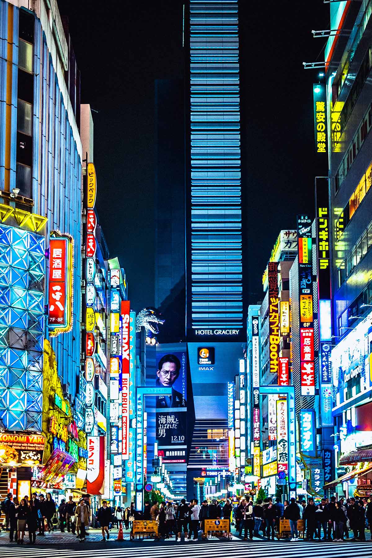
Photo by Erik Eastman on Unsplash
It was also explained earlier that the Japanese shun wastage. Thus, this attitude towards negative spaces has influenced the manner that they design their websites.
Technical differences
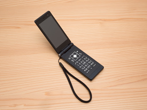
Long before smartphones, Japan already had their own version of the mobile web on advanced flip phones. Websites were then created for the flip phones’ smaller screens, thus they had to be designed to squeeze content into a minute space. This feature has continued to influence the way sites are designed to this day.
Furthermore, there is a lack of web fonts for non-Latin languages such as Chinese and Japanese because each font requires thousands of characters to be individually designed. It would be expensive, time-consuming, and would take a longer time to download. Thus, designers opt to use graphics instead of plain text to display non-standard typefaces.
Go localize!
The differences and specificity of the Japanese audience discussed throughout the article can make adapting a website for the Japanese market a lot more challenging than simply translating it. Several factors need to be taken into account so as to provide a user-friendly experience through the tools fit for the target market.
The mere translation of a website that neglects the layout and design features as mentioned earlier could result in a costly mistake. Not paying any attention to the huge difference in the preferences of the target market could cause users to become uninterested in the content. Thus, having professional localization services is very much recommended in these cases. There is a need for experts to explore the main web design trends of the market in order to meet the needs of the users.
Summary
In a nutshell, Japanese websites are quite different in contrast to their western counterparts. Some of the unique characteristics of a Japanese web page include densely packed text, busy layout, tiny low-resolution images, cute characters, and the use of flash animation. These features that make Japanese websites stand out have several different reasons that are linguistic, cultural, and technical in nature. Thus, localization of websites into Japanese goes beyond mere translation. It requires the expertise of professionals in order to utilize the main web design trends that will make the website meet the needs of the users.
Learn more about localizing your website for the Japanese audience today by contacting us at Info Cubic Japan.
well worth a read, got great insights and information from your blog. Thanks!
It turns out they are just not updating their website very often. Check honda’s website again, it’s not that Japanese-style: https://www.honda.co.jp/
Hi Arthur,
Thank you for your comment. This post is indeed due for some updates 🙂 However, most of the points still holds true even today.
Thanks for sharing this helpful information